
Gary the owner of The Suffolk Distillery commissioned me in 2020 to design a beer brand and packaging concept for a concept brewery specialising in gluten-free beer.
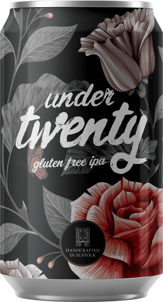
The name “Under Twenty” is a technical term within the brewing process that identifies how much gluten parts per million is in beer. If it’s under twenty parts per million it’s classed as gluten-free.
THE BRIEF
The brief came at a time when I was revolting against traditional logo design. I wanted to really push what a logo could be and in reality it could be anything – it just needs to work for the business and their customers.
The client asked me to consider the following objectives;
- It had to have “handcrafted” as its core value.
- The beer’s brand had work on a shelf in a crowded supermarket but also had to fit in happily in a bar in Shoreditch or a smart gastro-pub in Suffolk.
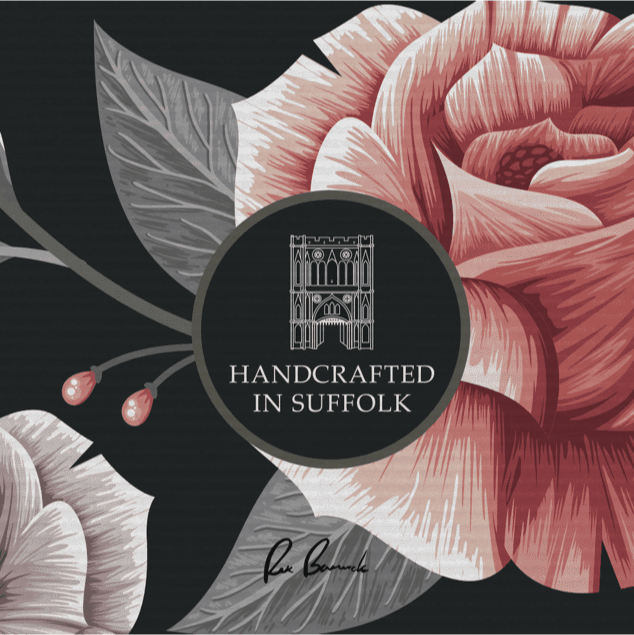
- It had to have a nod to Suffolk heritage in some way.
MY APPROACH
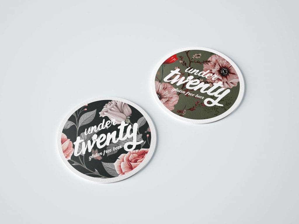
I wanted to use a script font for the logo and design a logotype instead of anything too abstract. I couldn’t find a font that had the authenticity I was looking for. The fonts were either too polished or over worked with fake texture which became frustrating.
So I had the idea of using a style called “Typographic Scrawl” which is less refined than traditional typography. I traced a font called “Signpainter” with my finger using acrylic paint. I previously discovered in a painting of mine that when i did this on acetate I created wonderful textures with the prints my fingers made.
I deliberately left the logo unpolished in the Typographic Scrawl style to encourage these textures to come through. It hit all the right notes I was looking for as a logo concept – The client agreed in it’s entirety.
Beer Branding that nods to suffolk’s past
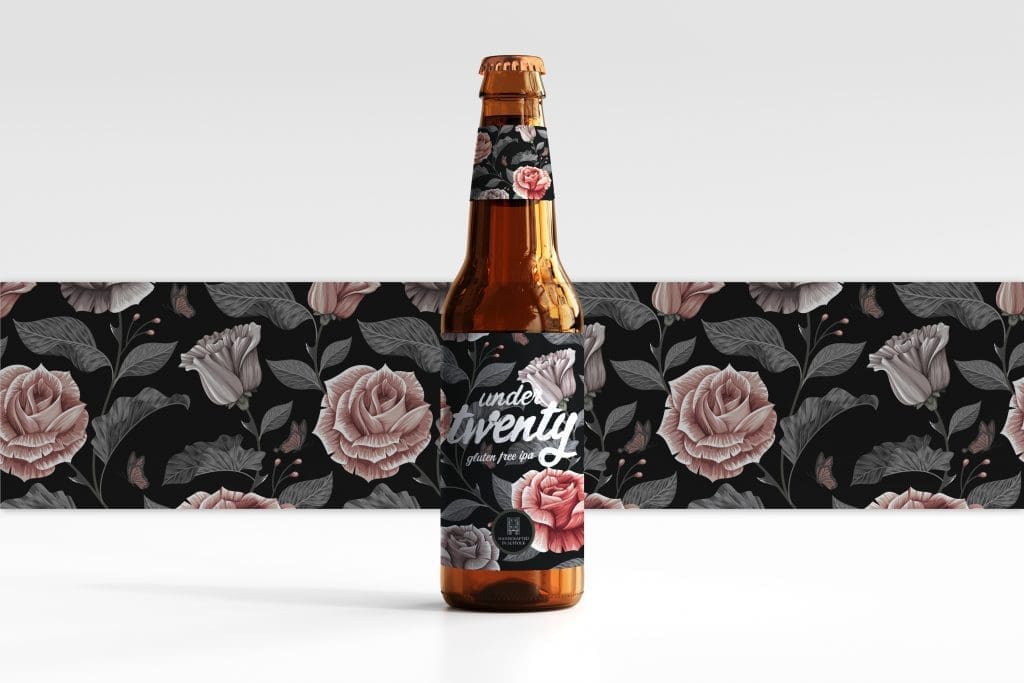
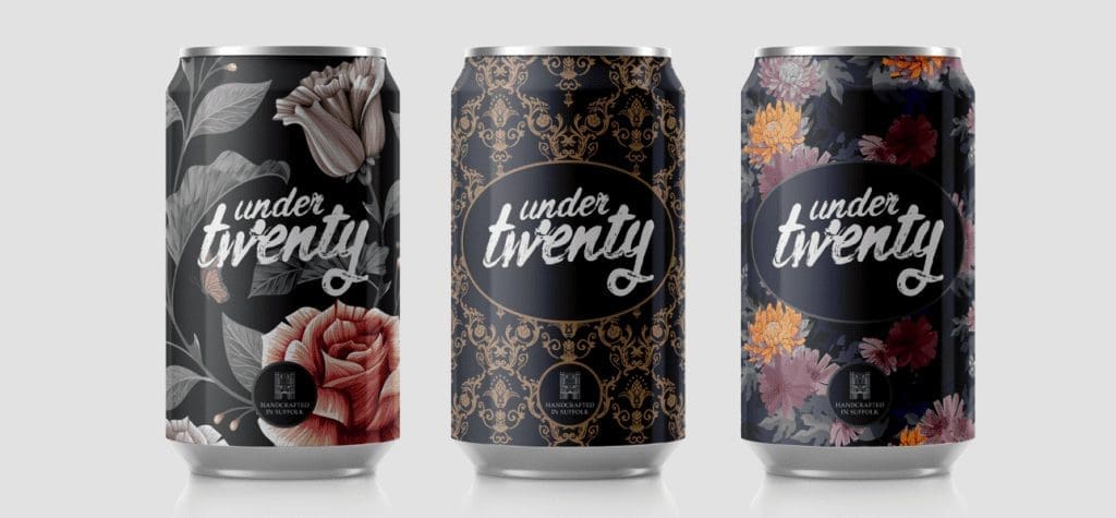
To help the brand pay homage to Suffolk Heritage I researched into local history and in particular the history of silk weaving in the nearby town of Sudbury. Weavers like Gainsborough provided inspiration for the patterned backgrounds. As this project was briefed as a conceptual project by the client I didn’t have budget to create backgrounds of my own so I relied on stock imagery to sell the vision. The patterns I chose felt like luxury silk wallpaper patterns but also felt fashionable; like tattoos. So they fit the strange demographic originally briefed.
FINAL THOUGHTS
I really enjoyed working on this project. It pushed what’s possible with logo design and made something that is now very computer based more tactile and “hands-on”. Perfect for craft beer branding.
The client was blown away by the design and we’re planning on finding a brewing partner to start creating the beer so hopefully you’ll be able to buy these cans and with it a piece of art soon.
GET IN TOUCH