
My Portfolio
The Hartest Brewing Co Beer Branding
Logo Design & packaging
Client: The Hartest Brewing Co
The Hartest Brewing Co was a part-time micro brewery project that’s looking to do good from drinking quality beer.
THE BRIEF
I set up The Hartest Brewing Co a few years ago with some friends as a side project to explore how we could improve the local beer scene in our village.
I was tasked to design a brand that had to stand out in the market.
- It had to pay homage to the village.
- The beer’s brand had work on a shelf in a crowded supermarket or bottle-shop.
- It had to be daring but in a mature way.
MY APPROACH
The current craft beer and cider market is a very bloated place. Dominated by brands adopting a very bold illustrative designs. As a co-founder of the brewery I was put in charge of designing our brand. We wanted our brand to stand out from competitors with our product story and philosophy being the core attraction – not just the label.
Whilst our brand needed to stand out on the shelves we had a lot of noisy brands to compete with. Instead of fighting for attention with shocking graphics, quirky names and hard marketing I stripped things back which did the job.
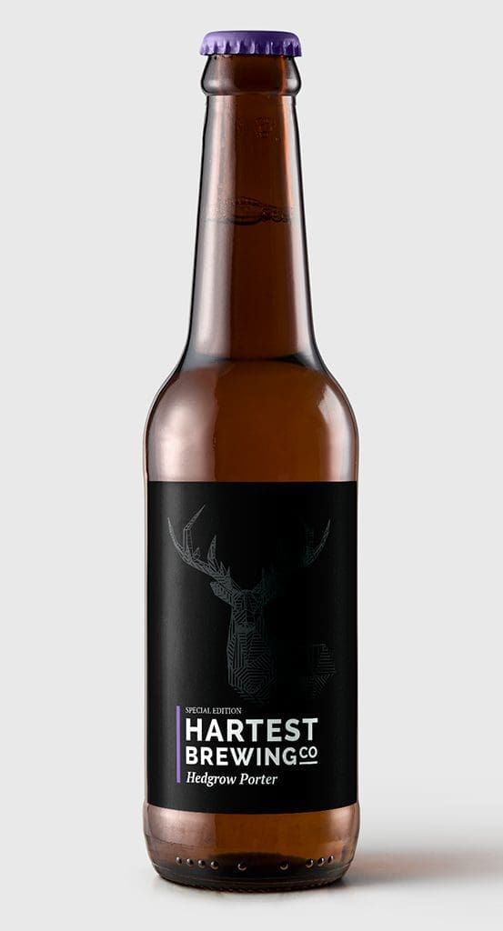
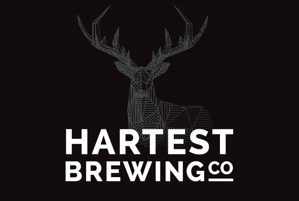
I am a huge fan of classical design before trends as classical lasts. Hartest Brewing Co’s branding uses a modern font chosen because the ‘w’ nods towards one of the co-owners pride and joy, his classic VW Camper van. The stag is the symbol of Hartest village which again is a nod to a local custom.
the Beer Bottle Label
When we were developing the product we trialed our beers with a community of locals. We blind-tasted the beers using different coloured bottle caps as tokens. The feedback was all really good but what became apparent weeks later is how people remembered the beer by the cap colour; “I liked the black one”, etc. This gave us an idea of keeping this flowing throughout the branding and graphic design, we toyed with no labels what-so-ever but we needed legal information included. We tried a pic of a bottle cap and naming them all “The red one” etc but this felt impersonal. Finally, we decided upon a logo that is supported by a coloured brand bar and a matching cap.
The cap gives retailers an easy reference when dealing with mixed cases and the colours are easier to remember that the individual names. Something that has not been lost with customers and retailers.
FINAL THOUGHTS
It was great working on something in an arena that had many products fighting for customer attention – I enjoyed going against the grain and designing something stripped back and minimal with small details making all the difference!

Listed as a Top 10 Brewery Brand Design at Designrush
Read the article ‘17 Best Beer and Brewery Logo Designs That Brew Creativity‘ – DesignRush.com
GET IN TOUCH